In this post we’ll create an orthonormal Cartesian plane with x axis, y axis and origin, using matplotlib.
If you’re using jupyter first include this line to get inline charts:
%matplotlib inline |
Add the required imports.
import numpy as np import matplotlib.pyplot as plt |
Define the x and y ranges, and the tick interval for both axes.
xmin, xmax, ymin, ymax = -5, 5, -5, 5 ticks_frequency = 1 |
Create a figure and an axes object. Also set the face color. This will cover transparent margins.
fig, ax = plt.subplots(figsize=(10, 10)) fig.patch.set_facecolor('#ffffff') |
Apply the ranges to the axes.
ax.set(xlim=(xmin-1, xmax+1), ylim=(ymin-1, ymax+1), aspect='equal') |
Set both axes to the zero position.
ax.spines['bottom'].set_position('zero') ax.spines['left'].set_position('zero') |
Hide the top and right spines.
ax.spines['top'].set_visible(False) ax.spines['right'].set_visible(False) |
Set the x and y labels, and add an origin label.
ax.set_xlabel('$x$', size=14, labelpad=-24, x=1.02) ax.set_ylabel('$y$', size=14, labelpad=-21, y=1.02, rotation=0) plt.text(0.49, 0.49, r"$O$", ha='right', va='top', transform=ax.transAxes, horizontalalignment='center', fontsize=14) |
Now create the x and the y ticks, and apply them to both axes.
x_ticks = np.arange(xmin, xmax+1, ticks_frequency) y_ticks = np.arange(ymin, ymax+1, ticks_frequency) ax.set_xticks(x_ticks[x_ticks != 0]) ax.set_yticks(y_ticks[y_ticks != 0]) ax.set_xticks(np.arange(xmin, xmax+1), minor=True) ax.set_yticks(np.arange(ymin, ymax+1), minor=True) |
Finally, add a grid.
ax.grid(which='both', color='grey', linewidth=1, linestyle='-', alpha=0.2) |
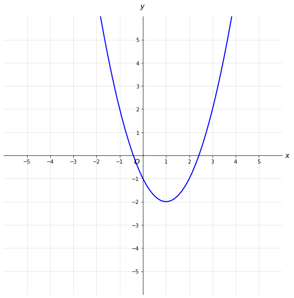
Now our cartesian plane is ready and we can plot a function on it.
def func(x): return ((x - 1 ) ** 2) - 2 x = np.linspace(-5, 10, 100) y = func(x) plt.plot(x, y, 'b', linewidth=2) |